|
|
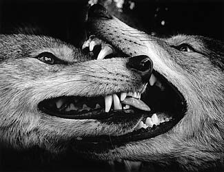
November ??, 2003 There is just something about black and white photography that color cannot duplicate. Check out Black & White magazine's online gallery: http://bandwmag.com/gallery/
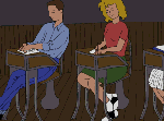
 Alum
Falls, Ohio is an online comic strip that details the life and
adventures of John Snavely growing up in the 1950s. It's an odd creation,
but very addictive. Alum
Falls, Ohio is an online comic strip that details the life and
adventures of John Snavely growing up in the 1950s. It's an odd creation,
but very addictive. http://www.alumfalls.com/
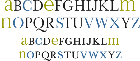
The plan for simplifying and improving our alphabet, entitled “Alphabet 26,” recommends the use of only one symbol for each of the 26 letters. Our conventional alphabet contains 19 letters having dissimilar upper and lower case symbols (such as ‘A’ and ‘a’) and 7 letters (c-o-s-v-w-x-z) having symbols that are identical. It is misleading for a letter, or for any graphic symbol, to have two different designs. Confusion might set in when school children are taught to recognize words even before they have learned to recognize different symbols for the same letter. To remedy this, Alphabet 26, a plan based
upon the logic of consistency, proposed that of the 19 letters that have
dissimilar symbols 15 letters should use the uppercase designs [black
letters below] and 4 letters should use the lowercase designs [green
letters]. The other 7 letters already have identical symbols [blue
letters]. Check out this video clip . . . makes you wonder a little bit about Japan: http://www.anabuki.co.jp/anabukin-chan/theater/qtmov/mov02.html
Why
swear words we're invented. The
figure
drawing lab. Subversive
crossstitch. The
History of
watches
and clocks. Drawings made by
children who were abducted by
aliens. Visit the
Sky High Airlines site.
|


